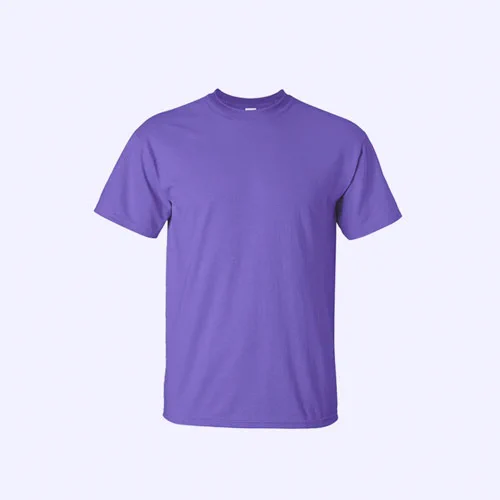
 $49.00
Cotton Tee
Lorem ipsum dolor sit amet conse bolli tetur adipiscing elit tortor eu.
Buy now Add to cart Mode CSS @microdom

A quarter of everything the web ships is JavaScript — and over a third of that never runs.¹
CSS fares no better: captive inside components or scattered across one-property classes. Either way, the cascade dies.
Media, blogs, catalogues, portfolios — none of them is an app. None of them needs a framework. A handful of bytes will do.
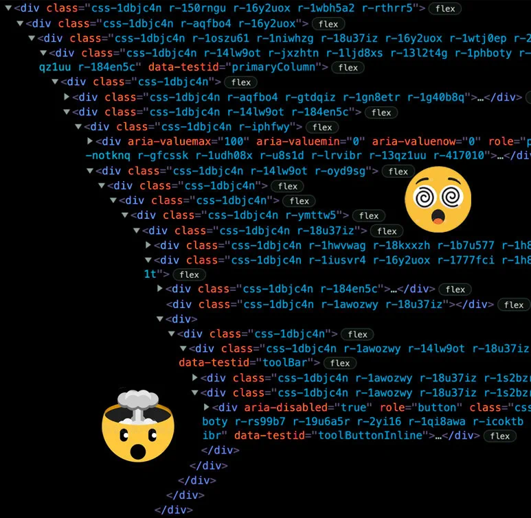
<section µ-hero="full" >
<img src="files/hero-v1.webp" alt="" loading="lazy">
<div>
<header>
<small> Hero · full bleed</small>
<h1> Chrome calls it 'wasted bytes'.<br/>
The industry calls it 'best practice'.</h1>
<p> A quarter of everything the web ships is JavaScript — and over a third of that never runs.¹ ...</p>
</header>
<div µ-flex >
<a href="#critical-insights" role="button"> View More</a>
<a href="https://github.com/microdom/mode.css" role="button"> GitHub</a>
</div>
</div>
</section> /* A direct > img child turns the hero into a full-bleed cover. */
[µ-hero] {
position : relative; isolation : isolate; overflow : hidden;
max-width : var(--max-width); margin : 1.5rem auto;
padding : clamp(2rem, 5vw, 4rem);
border : 1px solid var(--color-border); border-radius : var(--radius);
background : var(--card-grad);
& > img { position : absolute; inset : 0; z-index : -2;
width : 100%; height : 100%; object-fit : cover; }
&:has(> img)::after { content : ""; position : absolute; inset : 0;
z-index : -1; background : linear-gradient(90deg, rgba(7,9,13,.86), rgba(7,9,13,.45)); }
&:has(> img) h1 { -webkit-text-fill-color : #fff; color : #fff; background : none; }
}
/* full-bleed variant breaks the max-width, re-centres the inner column */
[µ-hero~="full"] {
max-width : 100%;
& > div { max-width : var(--max-width); margin : 0 auto; }
} 
Residual code launches a dual-front assault: it inflates page weight with useless data and completely hijacks the browser's Main Thread.
Worse yet, the dead JS code triggers an automatic blind spot for AI search engines.
Share of a median page's transfer that is actual readable content. The rest is structure — and machinery.
JavaScript the median page downloads, parses and compiles that never runs. Chrome's own audit calls it "wasted bytes".
GPTBot, ClaudeBot and Perplexity execute none. Content rendered client-side simply doesn't exist for them.
How much the probability of abandonment grows when load time goes from 1 to 3 seconds. People don't wait.
<section µ-grid="2-col content" id="critical-insights">
<figure>
<img src="files/content-v4-left-image.webp" alt="Analytics preview" width="773" height="755" loading="lazy">
</figure>
<div>
<header>
<small> By the numbers · Critical Insights</small>
<h2> A silent killer of page visibility</h2>
</header>
<p> Residual code launches a dual-front assault…</p>
<div µ-grid="2-col stats" >
<div> <b> ~2<span> %</span> </b> <h3> The words you came for</h3> <p> …</p> </div>
<div> <b> 251<span> KB</span> </b> <h3> Shipped, never executed</h3> <p> …</p> </div>
<!-- … 2 more … -->
</div>
</div>
</section> /* 2-col from mode.css; "content" adds the split rhythm,
"stats" styles the number sub-grid. */
[µ-grid~="content"] {
align-items : center; gap : clamp(1.5rem, 5vw, 3rem);
& > figure img, & > img { width : 100%; border-radius : var(--radius);
border : 1px solid var(--color-border); }
& header small { display : block; font-family : var(--font-mono);
letter-spacing : .18em; text-transform : uppercase; color : var(--steel); }
}
[µ-grid~="stats"] b {
display : block; font-family : var(--font-mono); font-weight : 700;
font-size : clamp(2rem, 5vw, 3rem); line-height : 1;
background : linear-gradient(120deg, var(--ember-2), var(--color-accent));
-webkit-background-clip : text; background-clip : text; color : transparent;
} Whether you're evaluating Mode CSS, comparing approaches, or simply wondering why things work differently here, these are the questions we hear most often.
Because content doesn't react. Reactivity machinery makes sense for apps with live, changing state — shipped to a page of text, it's cost without function. Even this accordion is a native <details> element: interaction, zero scripts.1
More than ranking ever did. AI crawlers execute no JavaScript, so whatever sits in your initial HTML is the entirety of what they can read — and cite. If your content renders client-side, you're not ranked lower. You're absent.2
They bolt server-rendered HTML onto the same machinery: the bundle still ships, hydration still runs, the class soup still buries the content. The simpler fix isn't rendering the framework earlier — it's not needing one for pages that never change.3
A chronic tax collected on every visit: up to 350 ms of CPU per 100 KB of JS on a mid-range phone, drained batteries, readers who bounce at second three, AI tokens burned on markup — and about half of that JavaScript never even runs.4
<section µ-faq id="faqs">
<header> <small> Good to know</small> <h2> Questions, answered</h2> <p> Whether you're evaluating…</p> </header>
<details open >
<summary> Why would a content site need zero JavaScript?</summary>
<p> Because content doesn't react…</p>
</details>
<!-- … 3 more … -->
</section> /* Pure native <details>/<summary> — the ::after marker flips +/– on [open]. */
[µ-faq] {
max-width : 780px; margin-inline : auto;
& details { border : 1px solid var(--color-border); border-radius : var(--radius);
background : var(--card-grad); padding : 1rem 1.2rem;
& p { margin : 0; color : var(--color-muted); }
}
& summary { cursor : pointer; font-weight : 600; color : var(--heading);
list-style : none; display : flex; align-items : center; gap : 1rem;
&::after { content : "+"; margin-left : auto;
color : var(--ember-2); font-weight : 700; font-size : 1.4rem; }
}
& details[open] summary { color : var(--ember-2); margin-bottom : .7rem;
&::after { content : "\2013"; }
}
} 
Plain HTML templating with Mode CSS.
No JS build step, no dead classes.
Fully readable for bots and humans
Everything you style lives in one of three attribute layers. Master these and you know the whole library.
| Layer | Role | Example |
|---|---|---|
| 1 · Structure | A bare attribute that establishes a layout. | <section µ-grid> |
| 2 · Modifier | Space-separated tokens that mutate the structure. | µ-grid="3-col cards" |
| 3 · Semantic | A domain attribute describing what the element is. | µ-pricing |
Attribute values name the thing, never a CSS property. If a value reads like a Tailwind utility, it's wrong.
| Example | Why | |
|---|---|---|
| ✓ do | µ-grid="pricing" | Describes the block. |
| ✗ don't | µ-grid=" | That's a property, not a thing. |
| ✗ don't | | Utility class in disguise. |
Template ModeClean markup, real cascading styles. Content, layout and hierarchy in plain sight — readable by humans, parseable by AI.
Lorem ipsum dolor sit amet consectetur adipiscing elit tortor eu egestas morbi sem vulputate etiam facilisis pellentesque ut quis.



<section>
<header>
<small> Gallery · The crew</small>
<h2> Meet the people</h2>
<p> Lorem ipsum…</p>
</header>
<div µ-grid="mosaic gallery" >
<figure> <img src="files/01-meet-our-team-v6.webp" alt="Team photo 1" width="800" height="607"></figure>
<figure> <img src="files/02-meet-our-team-v6.webp" alt="Team photo 2" width="600" height="455"></figure>
<figure> <img src="files/03-meet-our-team-v6.webp" alt="Team panorama" width="750" height="383"></figure>
</div>
</section> [µ-grid~="gallery"] {
display : grid; gap : 1.1rem; margin-block : 1.5rem var(--spacing);
& figure { margin : 0; border : 1px solid var(--color-border);
border-radius : var(--radius); overflow : hidden; position : relative;
transition : transform .18s ease, box-shadow .18s ease; }
& figure img { display : block; width : 100%; height : 100%;
object-fit : cover; transition : transform .35s ease; }
& figure:hover { transform : translateY(-3px); border-color : var(--steel); }
& figure:hover img { transform : scale(1.06); }
}
/* mosaic: the first tile spans 2x2, the rest fill densely around it */
[µ-grid~="mosaic"] {
grid-template-columns : repeat(3, 1fr); grid-auto-rows : 1fr; grid-auto-flow : dense;
& figure:first-child { grid-column : span 2; grid-row : span 2; }
} Lorem ipsum dolor sit amet consectetur adipiscing elit tortor eu egestas morbi sem vulputate etiam facilisis pellentesque ut quis.
$49.00Lorem ipsum dolor sit amet conse bolli tetur adipiscing elit tortor eu.
Buy now Add to cart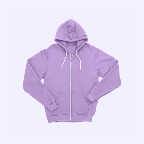 $199.00
Lorem ipsum dolor sit amet conse bolli tetur adipiscing elit tortor eu.
Buy now Add to cart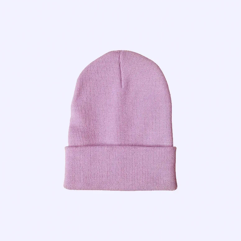 $49.00
Lorem ipsum dolor sit amet conse bolli tetur adipiscing elit tortor eu.
Buy now Add to cart<section>
<header>
<small> Shop · Featured picks</small>
<h2> Explore our latest product drop</h2>
<p> Lorem ipsum…</p>
</header>
<div µ-grid="3-col products centered" >
<article>
<figure>
<img src="files/tshirt-ecommerce-card.webp" alt="Cotton Tee">
<b> $49.00</b>
</figure>
<h3> Cotton Tee</h3>
<p> Lorem ipsum…</p>
<a href="#" role="button"> Buy now</a>
<a href="#" role="button"> Add to cart</a>
</article>
<!-- … 2 more products … -->
</div>
</section> [µ-grid~="products"] {
display : grid; grid-template-columns : repeat(3, 1fr); gap : 2rem;
& article { display : flex; flex-direction : column; gap : .55rem;
background : var(--card-grad); border : 1px solid var(--color-border);
border-radius : var(--radius); overflow : hidden; padding : 0 1.25rem 1.25rem; }
& figure { position : relative; margin : 0 -1.25rem 1rem; aspect-ratio : 4 / 3; overflow : hidden; }
/* price as a bare <b> badge over the image */
& figure b { position : absolute; top : .75rem; right : .75rem;
font-family : var(--font-mono); padding : .32rem .7rem; border-radius : 999px;
background : linear-gradient(135deg, var(--ember-2), var(--color-accent));
color : var(--color-accent-text); }
& a[role="button"] { width : 100%; }
}
/* centered: card becomes a 2-col grid so the two buttons sit side by side */
[µ-grid~="centered"] {
& article { display : grid; grid-template-columns : 1fr 1fr;
text-align : center; gap : .6rem; }
& figure, & h3, & p { grid-column : 1 / -1; }
& a[role="button"] { width : auto; }
} 
Lorem ipsum dolor sit amet consectetur adipiscing elit justo quis odio sit sit ac porttitor sit males dolor sit consectur dolor.
<section µ-blog >
<header>
<small> Featured story</small>
<h2> Stories & Insights</h2>
</header>
<article>
<img src="files/02-blog-images.webp" alt="Marketing analytics on a desk" width="1310" height="734">
<div>
<small> Strategy</small>
<h3> <a href="#"> Tuning your ad campaigns for a higher ROAS</a> </h3>
<p> Lorem ipsum…</p>
<footer>
<img src="files/sharon-avatar.webp" alt="">
<span> By <b> Sharon Green</b> · Jun 11, 2026</span>
</footer>
</div>
</article>
</section> /* Standalone [µ-blog] with no grid → one wide article (image | copy). */
[µ-blog] article {
border : 1px solid var(--color-border); border-radius : var(--radius);
background : var(--card-grad); overflow : hidden;
display : grid; grid-template-columns : 1fr; gap : 0; padding : 0;
& > img { width : 100%; min-height : 240px; object-fit : cover; }
& > div { display : flex; flex-direction : column; padding : clamp(1.2rem, 3vw, 2rem); }
& footer { display : flex; align-items : center; gap : .6rem; margin-top : auto; }
& footer img { width : 34px; height : 34px; border-radius : 50%; object-fit : cover; }
}
@media (min-width: 768px) {
[µ-blog] > article { grid-template-columns : 1.15fr .85fr; }
[µ-blog] > article > img { grid-row : 1 / 99; }
}  Playbook · Jan 20, 2026
Lorem ipsum dolor sit amet consectetur adipiscing elit justo quis odio sit sit ac porttitor sit males dolor sit consectur dolor.
 Strategy · Jun 11, 2026
Lorem ipsum dolor sit amet consectetur adipiscing elit justo quis odio sit sit ac porttitor sit males dolor sit consectur dolor.
 Playbook · Jan 16, 2026
Lorem ipsum dolor sit amet consectetur adipiscing elit justo quis odio sit sit ac porttitor sit males dolor sit consectur dolor.
<section µ-grid="3-col blog" >
<header>
<small> Browse</small>
<h2> Fresh off the blog</h2>
</header>
<nav>
<a href="#" aria-current="true"> All</a>
<a href="#"> Growth</a> <!-- … 2 more … -->
</nav>
<article>
<img src="files/01-blog-images.webp" alt="">
<small> Playbook · Jan 20, 2026</small>
<h3> <a href="#"> Why retention beats acquisition every time</a> </h3>
<p> Lorem ipsum…</p>
</article>
<!-- … 2 more articles … -->
</section> /* 3-col from mode.css; "blog" skins the cards + filter nav. */
[µ-grid~="blog"] {
& > header { grid-column : 1 / -1; }
& article { border : 1px solid var(--color-border); border-radius : var(--radius);
background : var(--card-grad); overflow : hidden;
display : flex; flex-direction : column; }
& article small { font-family : var(--font-mono); text-transform : uppercase;
letter-spacing : .07em; color : var(--steel); }
/* card image bleeds to the card edges */
& article > img { margin : calc(var(--spacing) * -1) calc(var(--spacing) * -1) var(--spacing);
width : calc(100% + (var(--spacing) * 2)); aspect-ratio : 16 / 9; object-fit : cover; }
& nav { display : flex; flex-wrap : wrap; gap : .5rem; grid-column : 1 / -1; }
& nav a[aria-current="true"] { color : var(--ember-2);
border-color : color-mix(in srgb, var(--color-accent) 45%, transparent); }
} Lorem ipsum dolor sit amet consectetur adipiscing elit tortor eu egestas morbi sem vulputate etiam facilisis pellentesque ut quis.



<section>
<header>
<small> On the 'gram · Latest shots</small>
<h2> Follow along on <a href="https://www.instagram.com/"> Instagram</a> </h2>
<p> Lorem ipsum…</p>
</header>
<div µ-grid="4-col gallery" >
<figure>
<img src="files/01-instagram-image.webp" alt="Instagram photo 1" width="544" height="544">
</figure>
<!-- … 3 more … -->
</div>
<p µ-flex >
<a href="http://instagram.com" role="button"> Follow us</a>
</p>
</section> /* Same [µ-grid~="gallery"] tiles; the "4-col" token (from mode.css)
just sets four fixed tracks that collapse on small screens.*/
[µ-grid~="gallery"] {
display : grid; gap : 1.1rem; margin-block : 1.5rem var(--spacing);
& figure { border : 1px solid var(--color-border); border-radius : var(--radius);
overflow : hidden; position : relative; transition : transform .18s ease; }
& figure img { width : 100%; height : 100%; object-fit : cover;
transition : transform .35s ease; }
& figure:hover img { transform : scale(1.06); }
}
/* an inline <a> inside a gallery heading gets the accent treatment */
section > header h2 a { color : var(--steel); text-underline-offset : 4px; }